


Track whether the intended people can use AI, whether they use it on suitable work, and whether that work meets its quality standard. Add effort, turnaround or cost measures where they help you decide what to change. For every percentage, name the population and reporting period.
The useful set is small enough that someone can explain each measure and act on it. A dashboard with more numbers can still leave you unable to answer a straightforward question: should this team receive more support, a different tool or a larger budget?
In a July 2026 Reddit discussion, a person describing a small-to-medium startup raised exactly that problem. Their company had several AI tools, separate dashboards and requests for higher usage limits. They could see seats and spending but struggled to justify which requests deserved more budget. Replies disagreed about whether IT or the relevant manager should make the judgment. The account provides no measured result, but it makes the ownership problem concrete.
This reference is for the adoption lead and workflow owners building that judgment together. For the broader question of whether an improvement creates value, use the guide to measuring AI value at work.
Define who belongs in the number
Start with the people and work your program intends to support. Record who is eligible, who has approved access and who had a relevant opportunity to use the tool during the period. Keep those groups distinct.
Suppose an online retailer's customer-service department has 100 people. Sixty advisers handle delivery enquiries and have approved access to an AI tool for drafting replies from order records. The other 40 handle work outside this trial. Over four weeks, 30 of the eligible advisers generate at least one delivery-reply draft. That is the activity being counted; whether a supervisor accepted the reply is a separate measure.
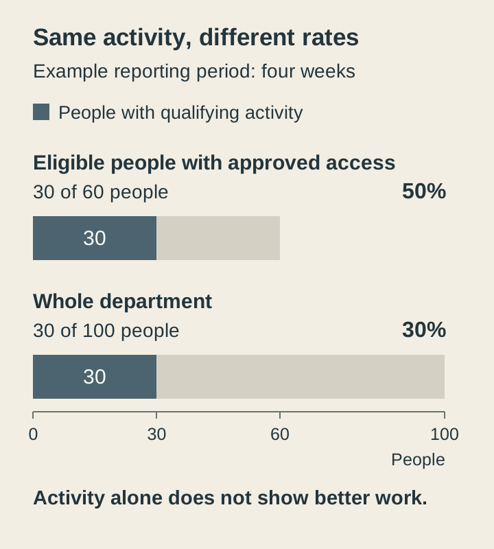
The first rate describes use among the eligible group with access. The second describes reach across the department. Neither establishes that anyone's work improved.
Define eligibility before looking at the result. Otherwise, removing people who did not use the tool can make the rate rise without changing anyone's experience. If eligible people are waiting for access, show that gap separately rather than quietly excluding them from the rollout report.
Keep the definition stable between reviews. When the rollout expands or the qualifying activity changes, annotate the change and avoid presenting the two periods as directly comparable.
Choose usage measures for a specific decision
The definitions below are starting points to adapt to your workflow. Choose a reporting window that includes meaningful opportunities to do the work. A finance analyst preparing month-end expense commentary has fewer opportunities than a customer-service adviser answering delivery enquiries each day.
| Measure | Define the calculation | Decision it can support |
|---|---|---|
Access coverage | Eligible people with working, approved access divided by all people eligible for the rollout, on a stated date. | Resolve provisioning or access gaps. |
Active use | Distinct eligible people with access who perform a defined activity during the period, divided by that eligible group. | Investigate task fit, awareness or support needs. |
Repeat use | People active in the first period who use the workflow again in the next, divided by first-period users with access and a relevant opportunity in the next period. | Investigate whether the workflow remains useful after a first try. |
Workflow coverage | Eligible task instances using the approved AI workflow divided by all eligible instances observed in the same period. | Find where the workflow is being used or bypassed. |
For access coverage, an assigned license may be insufficient: check whether the person can actually use the approved workflow. For active use, specify the event you count. Opening an application, submitting a request and accepting an output describe different actions.
Use administrative records for access and available product telemetry for activity. Workflow coverage may require a task-system field or a short observation sample. If you sample, report the sampled tasks and selection method; do not label the result organization-wide coverage.
Count people once within a people-based measure. Someone using two tools is still one person. If you cannot reconcile identities appropriately across systems, report separate tool populations and say that they overlap. Adding the user totals would overstate reach.
Repeat use needs particular care. Someone who no longer has the task is different from someone who had the opportunity and chose another method. Record that distinction, including how many people were excluded or had unknown opportunities. The activation and retention cohort example shows how to follow the starting group without losing those distinctions.
Pair use with accepted work
A usage measure tells you where to investigate. To decide whether the workflow deserves to continue or expand, add a measure of the work it produces.
Choose the quality criteria with the person who relies on the output. A correct answer that omits the required evidence may still be unusable. A fast draft that requires extensive correction may shift effort to its reviewer.
| Measure | What to record | Important limit |
|---|---|---|
First-review acceptance | Outputs meeting the agreed criteria at first review, divided by all outputs reviewed in the stated sample and period. | Keep the review standard and sample selection visible. |
Rework | Outputs requiring correction divided by reviewed outputs, with correction effort recorded where feasible. | A small edit and a complete rewrite should not look equivalent. |
Human effort per accepted task | Total staff time spent on a defined set of attempts, including failed attempts and review, divided by accepted completed tasks from that set. | Report unfinished work separately; mismatched input and completion periods distort the ratio. |
End-to-end turnaround | Elapsed time from a defined start to accepted completion for comparable tasks; report the chosen summary and sample size. | Waiting time differs from active labor. Track unfinished tasks so slow work does not disappear. |
These definitions make the data interpretable; they do not prove that AI caused a change. Keep the task mix, staffing and other process changes visible. The value guide's comparison checks explain what stronger conclusions require.
For a pilot, a small, clearly described sample may be more practical than continuous tracking. Include ordinary work and failures, not only examples that people volunteer because they went well. If no task in the measured set reaches acceptance, report that fact and its total effort. The effort-per-accepted-task ratio is undefined, not zero.
Check what a dashboard label actually means
Product metrics can be useful while answering a narrower question than their labels suggest.
For example, Microsoft's Copilot Studio outcomes documentation, updated June 2026, distinguishes confirmed from implied success. A session can be classified as resolved after the End of Conversation topic when the user confirms success, or when the user does not answer and the session times out. One conversation can also produce multiple analytics sessions.
That makes “resolved sessions” different from “people who completed a task successfully.” If you need verified completion, establish the confirming evidence and report it separately from inferred resolution. A transfer to a person may also be the appropriate outcome for a task requiring human judgment.
Before importing a vendor measure, check:
- Unit: people, conversations, sessions, tasks or interactions.
- Event: what must happen for the counter to increase.
- Outcome: observed, explicitly confirmed, inferred or estimated.
- Coverage: which products, features and populations are included.
Keep modeled time savings labeled as estimates. Do not combine them with observed labor time as if they were collected in the same way.
Show gaps and reporting windows
Missing data should remain visible. A blank caused by incomplete collection, a privacy threshold or an unsupported tool does not mean no one used AI.
Microsoft's Copilot Dashboard documentation provides a concrete example. Its readiness, adoption and impact pages describe a previous-28-day window with a delay of up to six days. Survey sentiment uses the survey period. The Microsoft 365 admin-center reports offer different windows, so two reports viewed on the same day need not cover the same activity. Feature-level rows can also be suppressed below the configured minimum group size.
Put the following beside a report, rather than leaving readers to discover it in a separate spreadsheet:
- The start and end dates of the activity being measured.
- The latest complete data date and expected delay.
- The tools, teams or task types the collection misses.
- The number of observations and any suppressed or unknown values.
If coverage changes, establish whether a rising number reflects more activity or more complete collection. Do not average incompatible rates to make the discrepancy disappear.
Give the measure an owner and an action
Usage targets can become a request to make the report look better. In a July 2026 account on X, Lito described a manager saying that visible Copilot use would make their team look good to an AI-enthusiastic CEO. The short account does not establish what happened afterward or how the wider organization operated. It does illustrate why a team needs to know what a usage target is meant to accomplish.
For each metric, record the decision it can inform and who can interpret it. IT may own provisioning and collection. A workflow owner is better placed to explain whether the output is usable and what changed in the work. The adoption lead can bring those views together without turning a prompt count into an employee performance score.
Agree how the information will be used and who can access it. Review at a pace that fits the work and the data delay. When a result surprises you, talk to the people doing the task before prescribing more usage.
Questions about AI adoption metrics
What is a good AI adoption rate?
There is no useful universal target without defining who can use the tool, on which work and over what period. If 30 of a retailer's 60 eligible delivery advisers draft a reply over four weeks, the active-use rate is 50%. That tells the service manager where to investigate access or support, not whether customers received correct answers. Compare with the team's own baseline under the same definition, then check reply quality. The denominator example explains why the same activity can produce two different percentages.
Should we track prompts or tokens?
Track prompts or tokens when they help explain tool consumption, limits or a technical problem. Tokens are the units of text a model processes; their count does not tell you whether the work was useful. A delivery adviser may submit several prompts because a draft keeps inventing an arrival date. Check the order record, accepted reply and correction effort before treating higher usage as progress or approving more budget. The accepted-work measures connect activity to usable results.
How often should we review the metrics?
Review AI adoption over a period that includes relevant work and complete data. A customer-service manager might review delivery-reply activity weekly, while a finance manager needs another month-end expense review before judging repeat use on that task. Check the reporting delay before interpreting a fall: this week's dashboard may still show only part of this week's work. Keep the meeting schedule separate from the data period. The reporting-window checklist identifies the dates and gaps to show beside each number.
What should we do when two dashboards disagree?
Compare the people, counted events, dates, update delays and exclusions before deciding either dashboard is wrong. A retailer's report of advisers who drafted delivery replies will differ from a report counting every draft, because one adviser can create several. Check whether both reports cover the same eligible group and complete four-week period; record any unresolved difference. Do not average incompatible rates or choose the larger number. Use the dashboard-label checks to establish what each counter measures.